
UNITING COMPETITORS WITH BETTER RECOVERY
The Challenge
Enhanced Recovery Omega-3 Sports Drink had a great product that produced
remarkable results for hard-training athletes, but they hadn’t developed a strong
brand identity. Their brand mark and packaging lacked personality. Furthermore,
they failed to lay claim the product’s most ownable active ingredient – Omega-3. A
more visually compelling brand story was definitely in order.
What We did
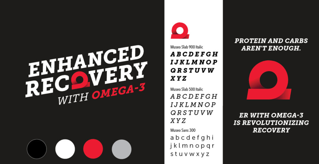
We set out to develop ER’s visual identity most efficiently by creating a series of
stylescapes that illustrate distinct visual directions. Each execution includes a
palette, fonts, graphic devices, and photo styling. Most important, they explore
platform ideas that brands use to launch marketing campaigns, create packaging,
and align their brand standards and galvanize their brand’s visual identity.
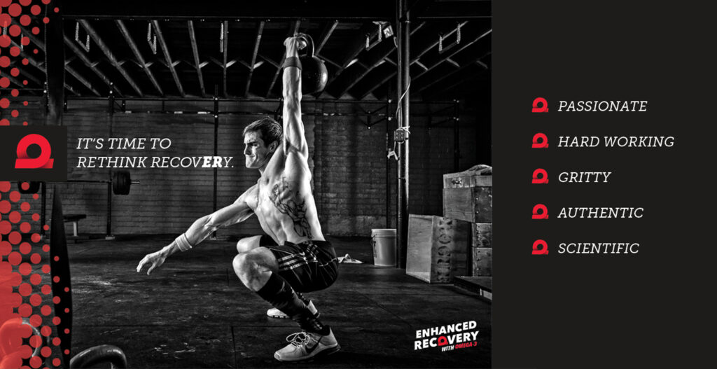
ROUND 1 STYLESCAPES


FINAL STYLESCAPE


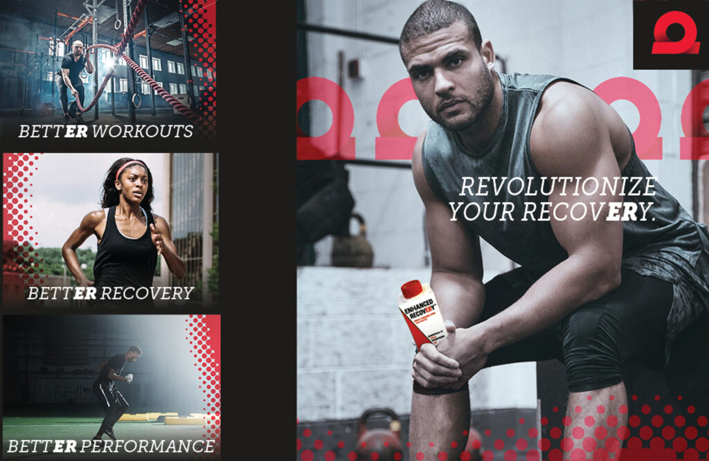
FINAL STYLESCAPE details
